Tablet vs Phone: Screen Size Calibration
Quick Answer
Tablet vs phone sensitivity in PUBG Mobile: Tablets need 10–20% lower Camera and ADS values than phones because the larger screen makes the same percentage cover more physical movement. Community codes are calibrated for phones and will feel too fast on tablets. Use AimSync to enter your tablet model and get a screen-size-calibrated profile.
Can you copy a sensitivity code generated for an iPhone 15 Pro Max and use it directly on an iPad Pro 11? The short answer is absolutely not. While the in-game settings numbers look identical, the physical feedback on your thumbs and wrists will feel completely mismatched. The physical surface area of your display changes the correlation between swipe distance and camera degrees of rotation.
Additionally, aspect ratios dictate your default Field of View (FOV). A wider layout gives you distinct tracking advantages, while a taller aspect ratio requires customized settings compensations. In this guide, we will analyze display physical math, aspect ratio distortions, and the exact formulas to scale your settings when transitioning between phones and tablets. To review tablet sizing and hardware specifications, check the Apple iPad Product Specs.
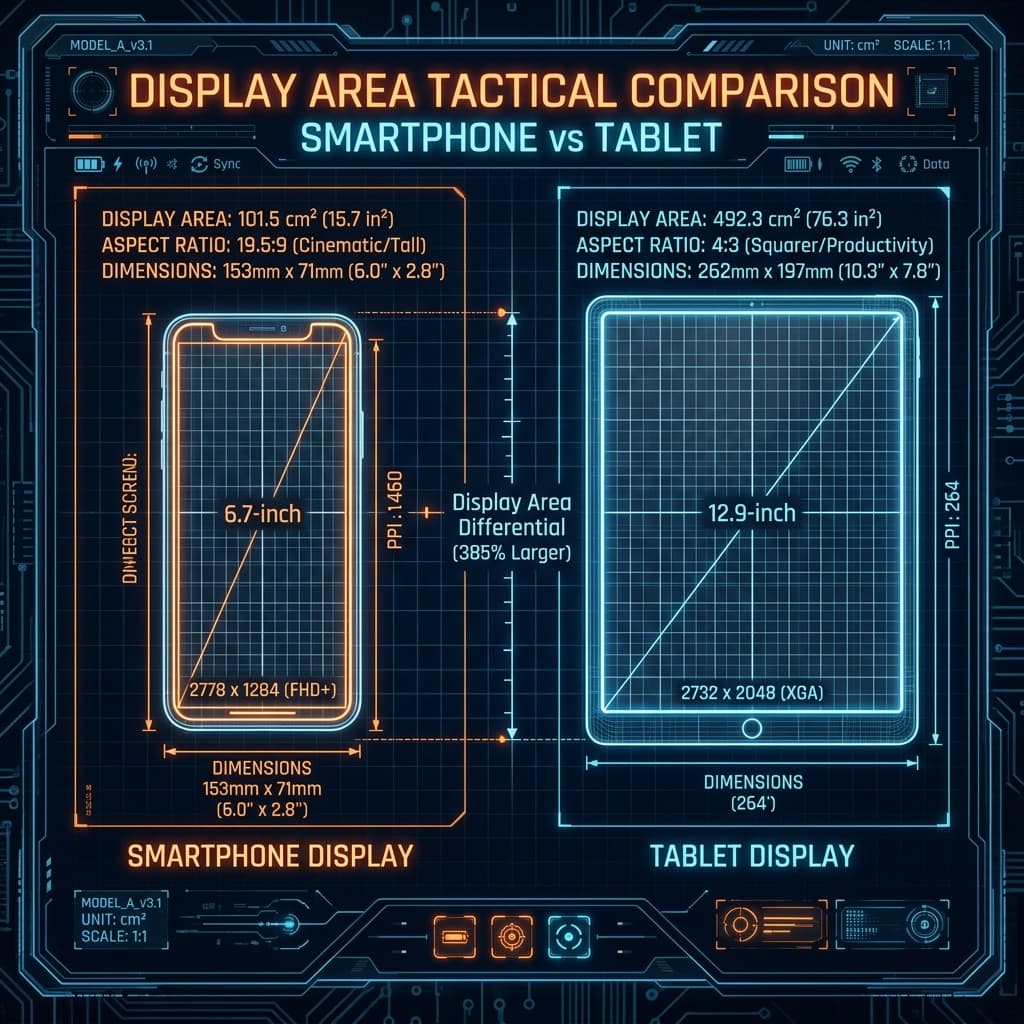
1. The Physical Math of Swipe Distances
On a standard 6.7-inch smartphone, the physical width of the touchscreen is roughly 15 centimeters. On an 11-inch tablet, it expands to over 24 centimeters. This physical space growth means:
- Coordinate Density (DPI): The engine tracks swipe distance based on pixel updates. If you swipe your thumb 3 centimeters on a phone, you cross roughly 20% of the display width. On a tablet, a 3-centimeter swipe covers less than 12% of the display width.
- Physical Thumb Range: Because your hand sizes remain the same, your thumb's natural swipe sweep is physically restricted. To perform a 180-degree rotation on a tablet with phone-optimized sensitivity, you would have to lift and swipe your thumb multiple times, resulting in slow reaction times.
- Scaling Rule: To achieve the same camera rotation feedback, **tablet users must increase their camera and ADS touch sensitivities by 10% to 20%** compared to phone baselines.
2. The Aspect Ratio FOV Factor
Smartphones typically feature ultra-wide aspect ratios (e.g. 19.5:9 or 20:9), while tablets utilize taller layouts (e.g. 4:3 or 16:10). This aspect ratio divergence heavily impacts your Field of View (FOV):
Taller tablet displays (4:3 aspect ratios) render less horizontal view but significantly **more vertical view**. Because objects on a tablet appear physically larger and closer, target tracking feels faster. This visual speed amplification can cause players to overcompensate.
To maintain visual tracking consistency, gyroscope configurations must be adjusted differently from touch coordinates. Because gyroscope tracking depends on physical wrist tilt angles rather than display width pixels, **tablet gyroscope sensitivity must be reduced by 5% to 15%** compared to phone profiles. This maintains crosshair stability during tracking sprays.
3. Weight and Ergonomics Impact on Gyroscope
A flagship phone weighs roughly 200 grams, whereas an iPad Pro weighs nearly 500 grams. This extra mass introduces structural physics constraints:
- Rotational Inertia: Tilting a heavy tablet requires more muscle effort and exhibits higher hand-shake dampening. Because the device's physical mass acts as a natural stabilizer, you can safely run slightly higher gyroscope settings thresholds on tablets for low-zoom scopes without introducing screen jitter.
- Claw Grip Positioning: Most tablet players place the device in their lap or on a desk stand, holding it only with their fingers using a 4-finger or 6-finger claw layout. This setup changes the angle of wrist movement, requiring players to calibrate custom gyroscope offsets to prevent vertical drift.
4. Display Scaling Calibration Blueprint
When transitioning your gameplay between display form factors, apply this calibration blueprint formula:
Scaling Formula
Touch Camera & ADS: Tablet Sensitivity = Phone Sensitivity × 1.15
Gyroscope Sights: Tablet Gyroscope = Phone Gyroscope × 0.90
Example: If your Phone Gyroscope 3x is 280%, the Tablet counterpart should be calibrated around 252% to counter aspect-ratio expansion.